IRCTC
2025
IRCTC Website Redesign
IRCTC Website Redesign is a UI/UX project focused on making the train booking journey simpler, clearer, and easier to navigate. Through research and user insights, I identified key pain points and explored solutions through improved flows, clearer information, and a more seamless interface.

Overview
Redesigning the Train Booking Experience
IRCTC Website Redesign was a UI/UX project focused on improving the overall train booking experience. Through user research, journey mapping, and usability insights, we identified pain points in the existing website and explored ways to make the experience simpler and easier to navigate. The project focused on creating a cleaner interface, clearer booking flows, and a more seamless digital experience for users.
Major Issues Identified
Train Booking Journey:
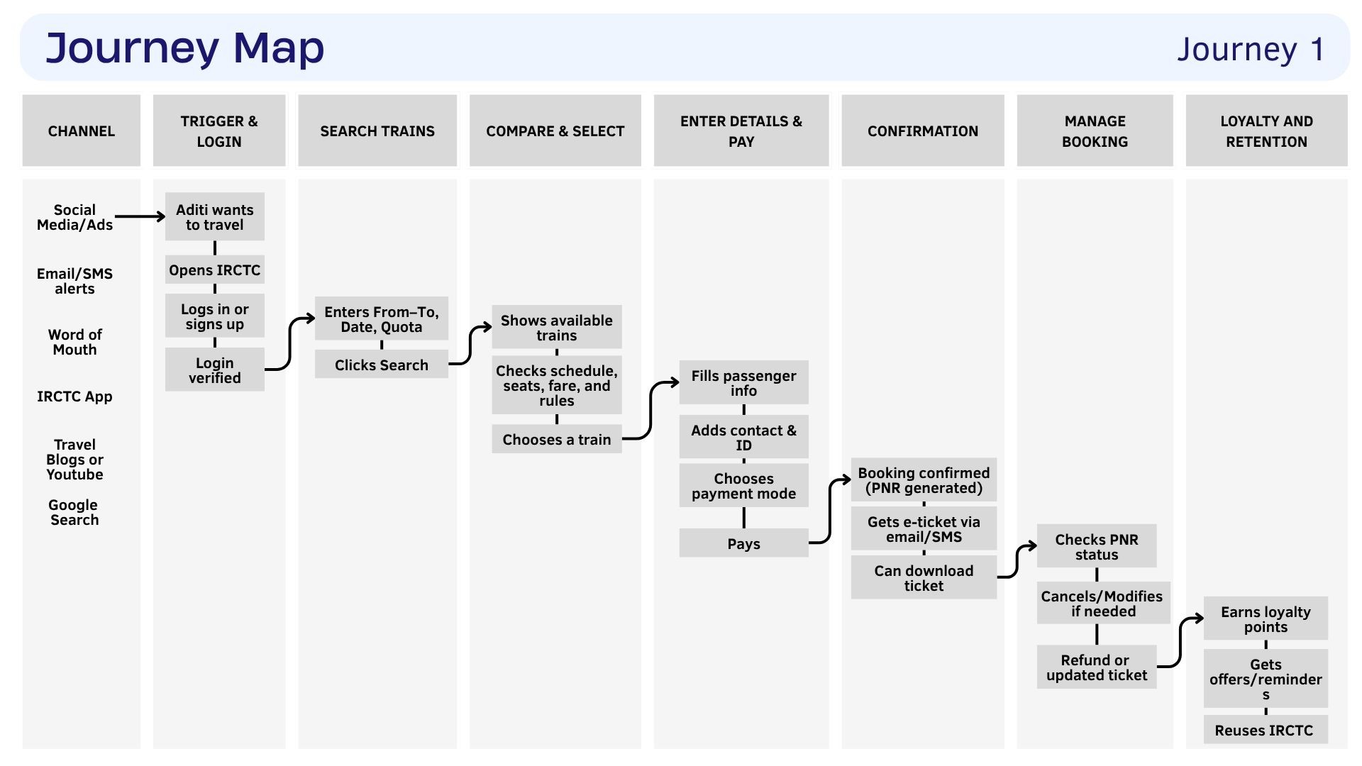
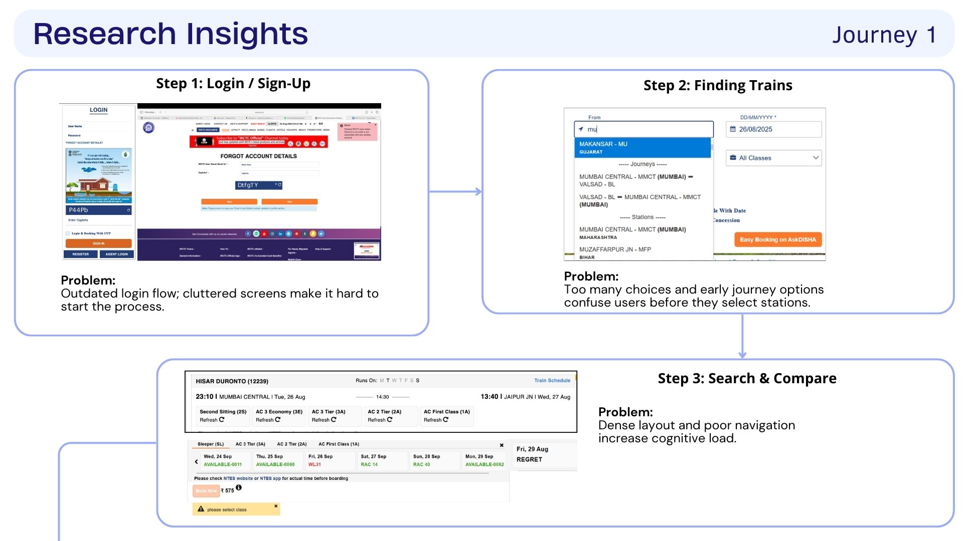
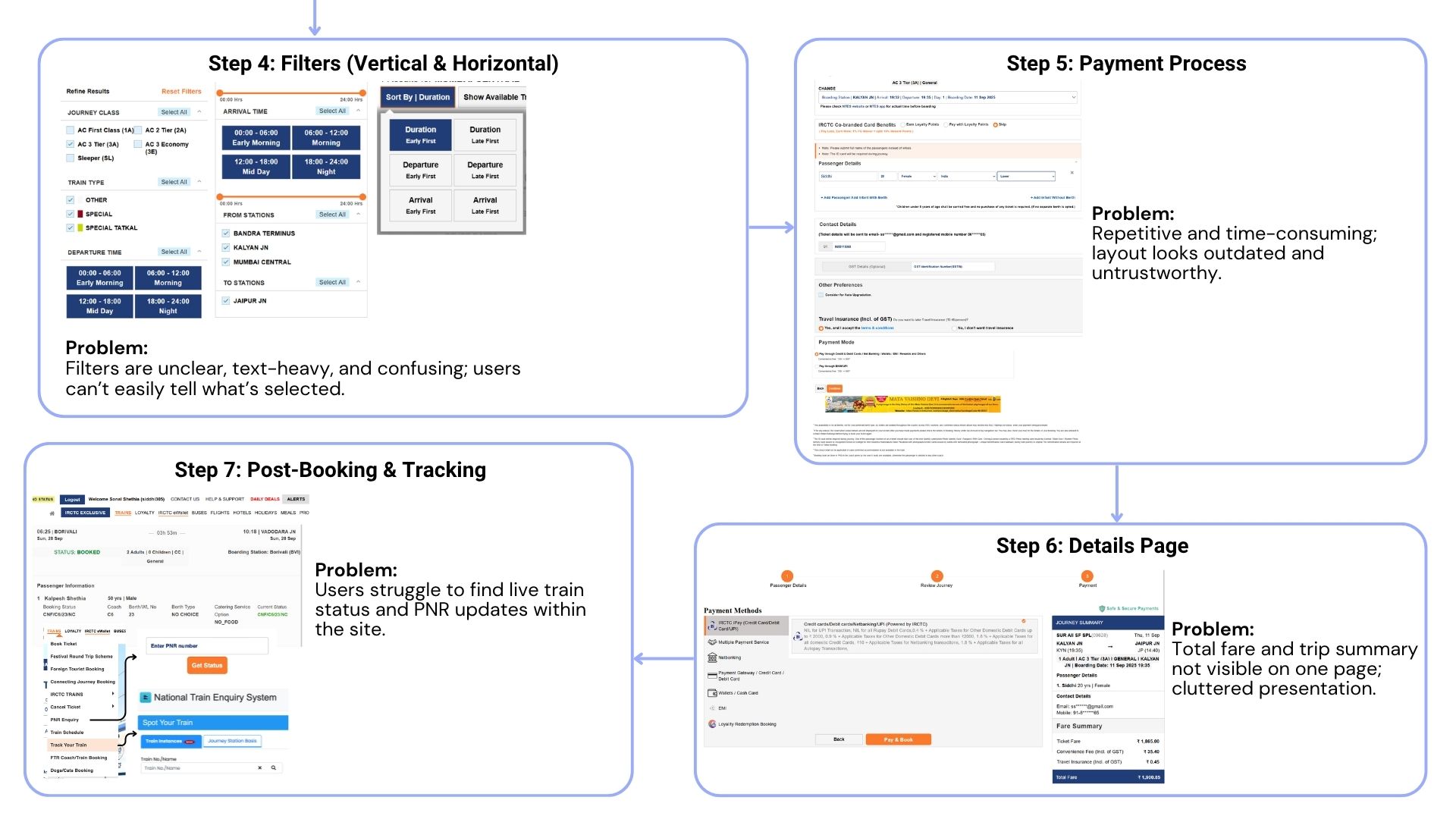
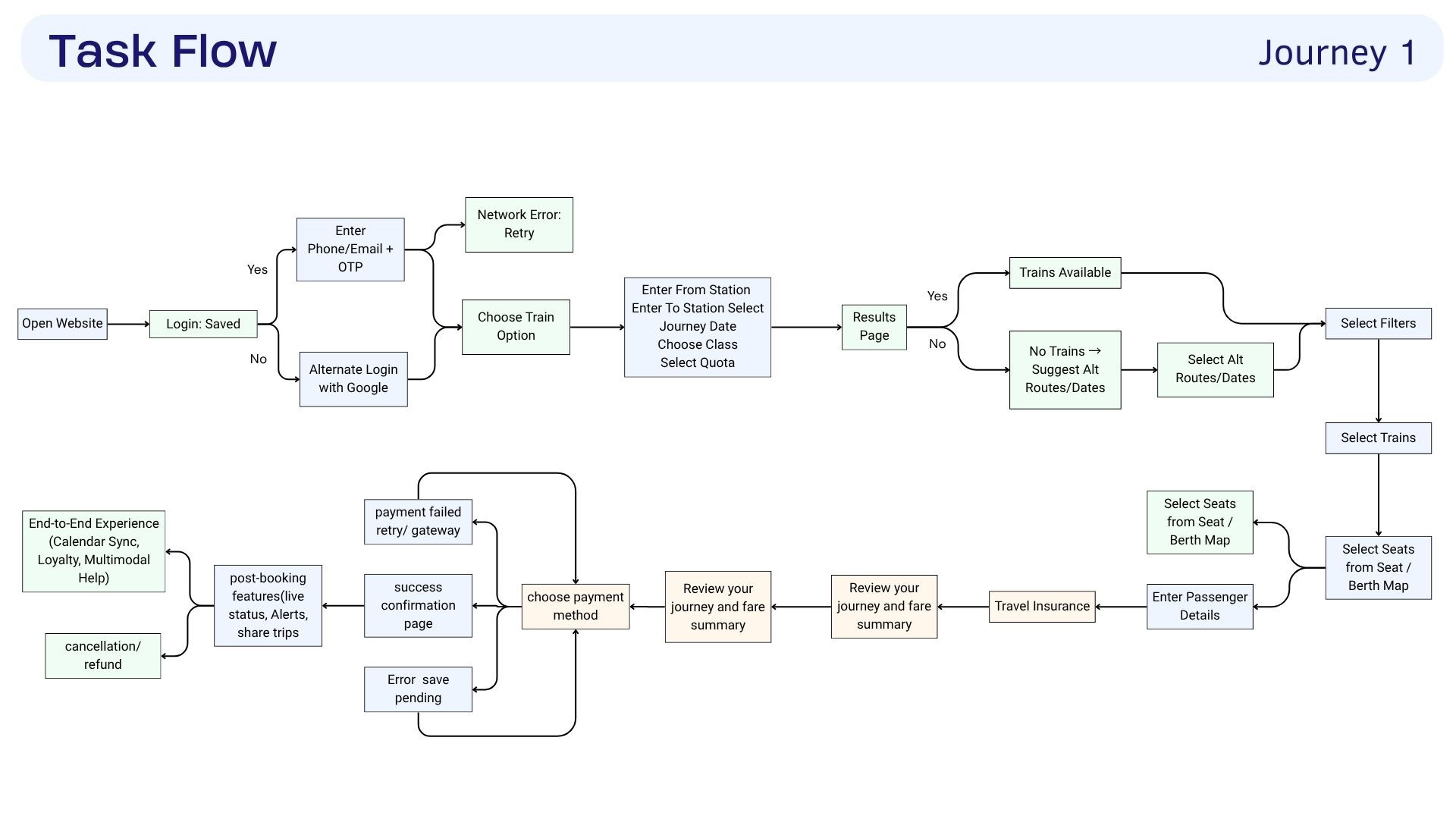
Users faced a confusing login flow, too many choices while searching, dense train results, unclear filters, and a lengthy payment and tracking process.
Tour Package Booking Journey:
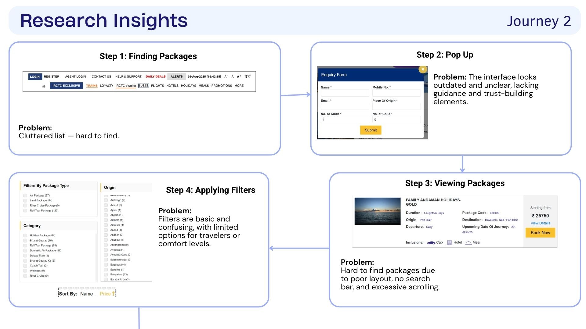
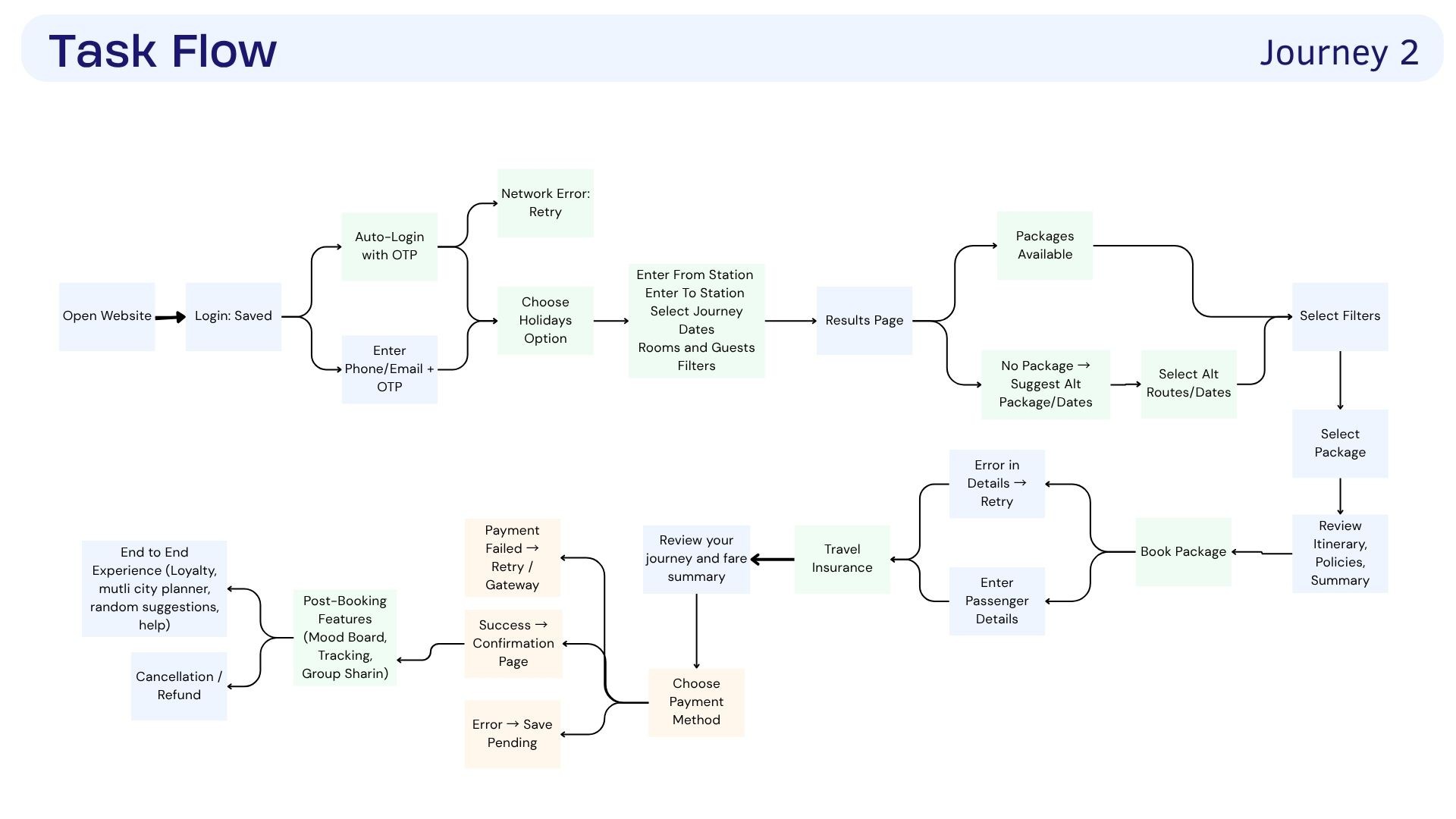
Users struggled to find packages, understand filters, navigate through outdated pop-ups, scan text-heavy information, and move through a rigid booking process.
My Role
UI Design
My role focused on the visual and interface design of the redesigned experience. I worked on creating cleaner layouts, improving information hierarchy, simplifying navigation, and designing interfaces that made both journeys feel more clear, intuitive, and easy to use.

Problem
Booking a journey felt more complicated than it needed to be
The existing IRCTC website made important tasks feel more complicated than they needed to be. Cluttered information, unclear navigation, outdated interfaces, and lengthy booking flows made it difficult for users to quickly find what they needed and complete their journey smoothly.

Research
Turning Insights into Ideas
The ideation process began by closely analysing both user journeys and identifying the challenges users faced at different stages. I mapped the pain points, grouped similar issues, and looked for patterns across the experiences. These insights helped identify key areas for improvement and guided the development of ideas focused on making the overall journey clearer, simpler, and easier to navigate.
What We Thought
We started by asking how the existing journey could be made simpler and easier to navigate. We explored ways to reduce clutter, organise information more clearly, and make important actions easier to find. The goal was to create a smoother experience without overwhelming users.
How might we
How might we redesign IRCTC to provide customers with a smooth, enjoyable experience and build brand loyalty?
After identifying the key pain points, we used How Might We questions to reframe the problems as opportunities. This helped us explore different ways to simplify navigation, organise information better, and make the booking journey easier and more intuitive..
Task Flow
Based on these opportunities, we created task flows to map out how users would move through the redesigned experience. This helped us simplify the steps, remove unnecessary complexity, and create a clearer path from searching for a journey to completing a booking.
UI Exploration
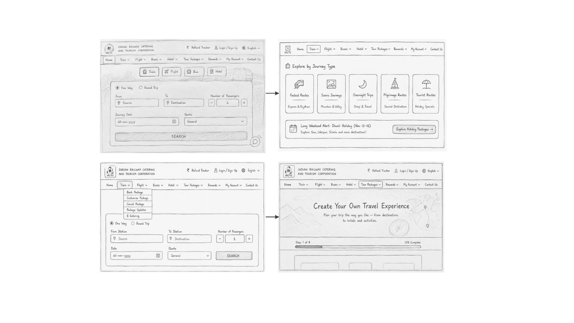
Refining the dashboard experience
Designing the Final Experience
The final screens bring the redesigned journey to life, combining clearer navigation, improved information hierarchy, and a more intuitive interface across the different travel experiences.
You can then show your screens under categories like:
01. Train Booking
A simpler way to search, select, and book a journey.
03. Tour Packages
A guided experience for users to plan and customise their trips step by step.
The Final Outcome
The final design brings together research, user insights, and thoughtful interface decisions into a clearer and more seamless travel experience.
Final Outcome
The final outcome is a redesigned IRCTC experience that makes the journey from searching to booking clearer and easier to navigate. By improving the information hierarchy, simplifying key flows, and creating a more intuitive interface, the redesign brings together user needs and thoughtful visual design to create a smoother and more engaging travel experience.
Key Learnings
This project taught me the importance of understanding the user journey before jumping into the design. I learned how research and user insights can help identify real problems, while task flows and wireframes create a strong foundation for the final interface. It also helped me understand how small UI decisions, clear information hierarchy, and simple interactions can make a big difference in the overall user experience.